I’m talking color today! Since I missed a day in the 31 Day Blog Challenge yesterday, I decided to beef it up today! 😉
If you do any printing, these acronyms might look familiar. Since I work with this every day, I realized that I know a few things that some people may not. So I thought I’d share a few interesting bits.
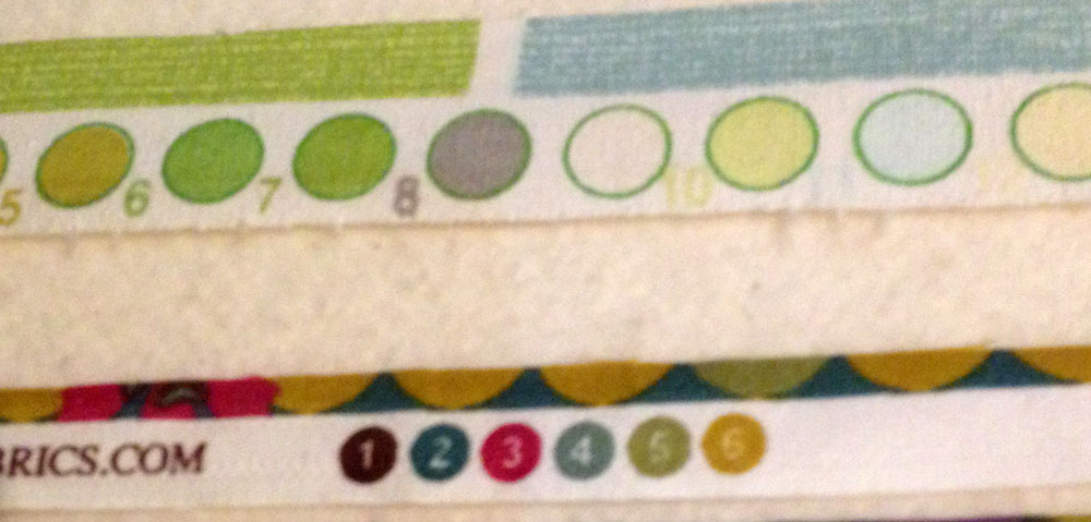
As quilters, you may have noticed on the selvages of fabric yardage, there are colored spots. They are usually circles, but sometimes the spots are different shapes – when the designers are being fun. The number of dots change from fabric to fabric.
Spot Color
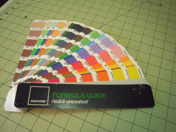
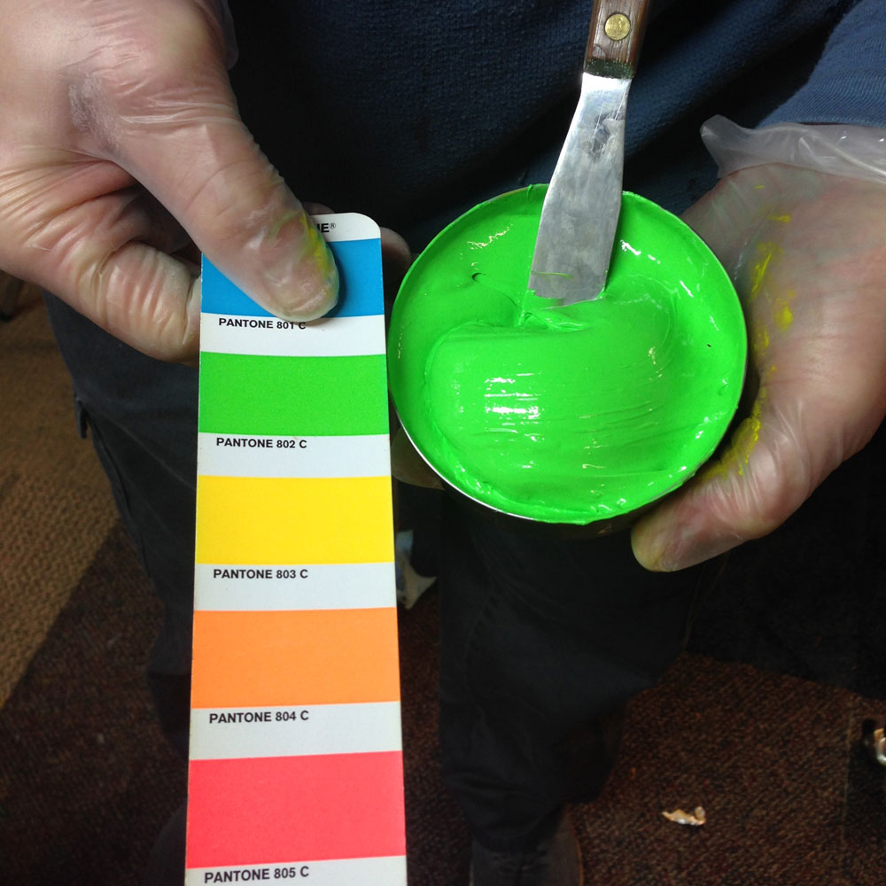
Each spot represents an ink color used in the print. Each one of those colors is mixed and printed individually. To make sure colors print correctly, the PMS or Pantone Matching System is used. PMS colors are used primarily in fabric printing and screen printing where only one color can be used in a screen, or printing plate. There is a PMS color matching guide book printed each year, where specific colors are numbered. Since these colors are printed as hard copy, and they all match exactly. You know if you ask for PMS 802C, you’ll get exactly what’s printed under 802C – which happens to be a neon green.
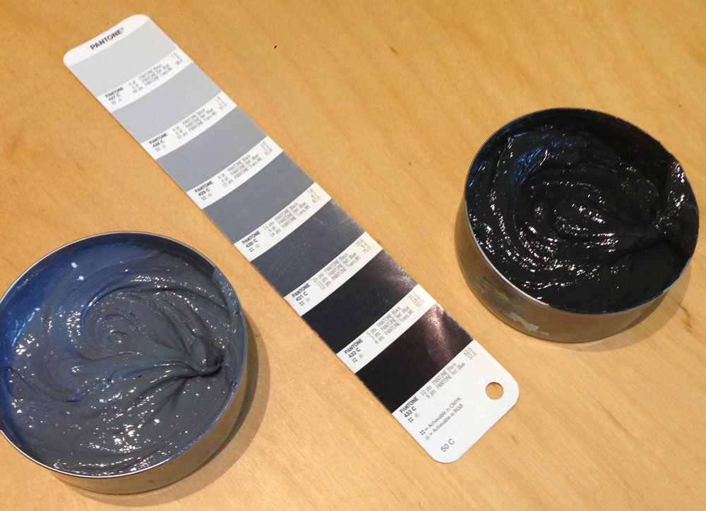
Most ink manufacturers have a mixing guide based on PMS. When we go to mix an ink, we can look up the number with the ink maker and find out the exact measurements of base ink colors to use. For instance, the grey colors below are PMS 431 (lighter) and PMS 432 (darker). The formulas to mix these two colors are very different, even though they are close to the same color.
The formulas look like this:
PMS 431= 47.25% White / 45.96% Black / 6.53% Blue / .26% Red
PMS 432 = 58.1% Black / 25.71% MarineBlue / 9.1% Green / 7.09% White
Once the PMS colors are mixed, they can be used in a screen (stencil) or printing plate.
CMYK
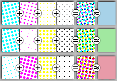
When printing on paper, and most other print applications, these grey inks would be created in a totally different way. A series of different colored dots would mix to create them. CMYK stands for: Cyan, Magenta, Yellow, and K for Black. This type of printing uses very small of dots of these transparent colors that overlap and create a full ranges of ink colors. Inkjet printing mimics this process for home printing use. When printing magazines, packaging, etc., it’s called 4-color Process Printing. This is done on large machines. Color correction is done by increasing and/or decreasing the size and saturation of dots used for each color.
CMYK is now used in the way of digital printing. There are companies like Spoonflower that use this process to print fabric. A whole bunch of new t-shirt printing companies are using this process on shirts and apparel too. This technology is getting better and better every year. It works great for custom items, especially for photographic images where hundreds of colors are actually used. However, color saturation and ability to match exact colors still leave a lot to be desired.
RGB and HEX
RGB and HEX are both terms for colors on a screen. They are based on colored light. RGB or Red, Green, and Blue are the three hues of light that create all colors on computer screens, monitors, lit signs, etc.; and HEX codes are used for identifying it’s specific colors.
When designing on a computer, you are looking at RGB color, and when you print you will be using either CMYK or PMS color. The transition between the two can be challenging the first time you try to print something.
If I were designing a T-shirt or fabric, I would use PMS colors. I would use the printed book as my guide since the monitor only shows color in RGB. The PMS colors would be specially mixed and used as solid or spot color fills.
If I were designing a magazine ad, I would use CMYK. CMYK is printed as a tiny dot matrix of these four colors that overlap to create full color prints. I may even throw in a special PMS color pop, if I have the extra money for printing.
Since RGB is the color source used on any screen, everything I design starts here. If I were designing a website, I’d use HEX color codes to choose specific colors.
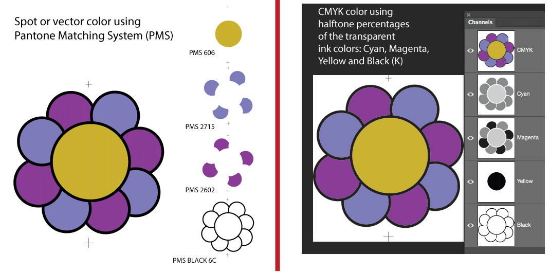
You may have designed something on your computer screen, then gone to print and your black turns out to look a little grey…? That is because you are designing in RGB for something that will print as CMYK. For anything printed, change your settings to CMYK and you will have much better success.
I’m hoping this all makes sense – once you understand how different color terms are used, it makes it easier to print with feelings of security.
Thanks for the lesson, Gail!
I loved reading about color today! My background is Typography and your informative post is spot-on and perfectly registered. I have always enjoyed seeing the colored spots of fabric selvages and sometimes refer to them when choosing a binding fabric. As you mentioned, they can even be found on cereal boxes, in magazines and newspapers, wrapping paper, etc.
Thanks! Those selvages can be super cute, and what a great idea to use them when picking out binding (or even backing) fabric!